Today when we buy something we are no longer driven by purely practical needs, but by precise psychological requirements, first and foremost the affirmation of our identity and the values in which we believe. In many cases we buy an item not only on the basis of its functional characteristics, but also of what it evokes in our minds: emotions, sensations and ideas that stimulate a sense of belonging or rejection and push us to prefer one item over another.
The packaging designer has the task of representing the "symbolic baggage" of a given object and brand through the choice of shapes, colors and materials in line with the brand identity and characteristics of the object itself. Moreover, he/she will have to study the graphics to differentiate the product from the competitors and catch the consumer's attention, pushing him/her to dwell on the content of the package.
However, in particularly saturated market sectors, using lively or extravagant graphics is not enough to make the product stand out from the others on the shelf. This is where the designer's creativity comes into play, or, according to Umberto Eco's felicitous definition, "the ability to combine elements that already exist in a new way". This "ars combinatoria" can help to develop packaging with an attractive and functional design, capable of communicating with the "ideal client" and conquering new market shares.
What does it take to create packaging that is not just original, but creative in the true sense of the word? While there is no secret recipe for creativity, designers can look to other industries and sectors for interesting ideas to adapt, modify and recombine in new ways. Creative packaging will put a unique spin on your product and brand, improving sales and increasing brand awareness.
Below we have collected some examples of creative packaging particularly successful, proposed by Italian and foreign brands.
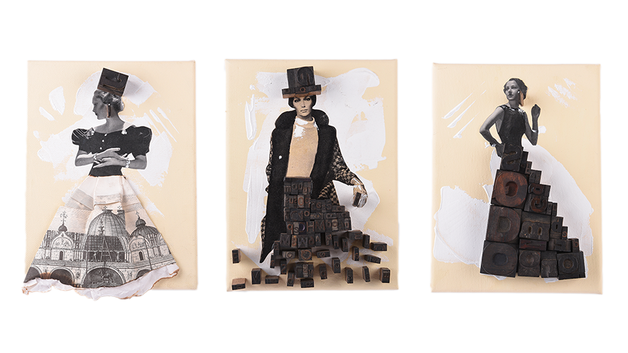
Caffè Morandini
For the company's new line of compostable and biodegradable capsules and pods, artist Sara Lovari has created true works of art through the assemblage technique, using only recycled materials such as stamps, paper from newspapers or vintage magazines and...coffee powder! His works, depicted in the product packaging, have allowed to obtain a really refined and particular result. A perfect example of the union between art and packaging - we talked about it some time ago in the article "Packaging d'artista" (Artist's Packaging) - which manages to effectively communicate the values linked to the product: eco-sustainability and the tradition of Made in Italy.
-png.png)
Cowberry Crossing Farm
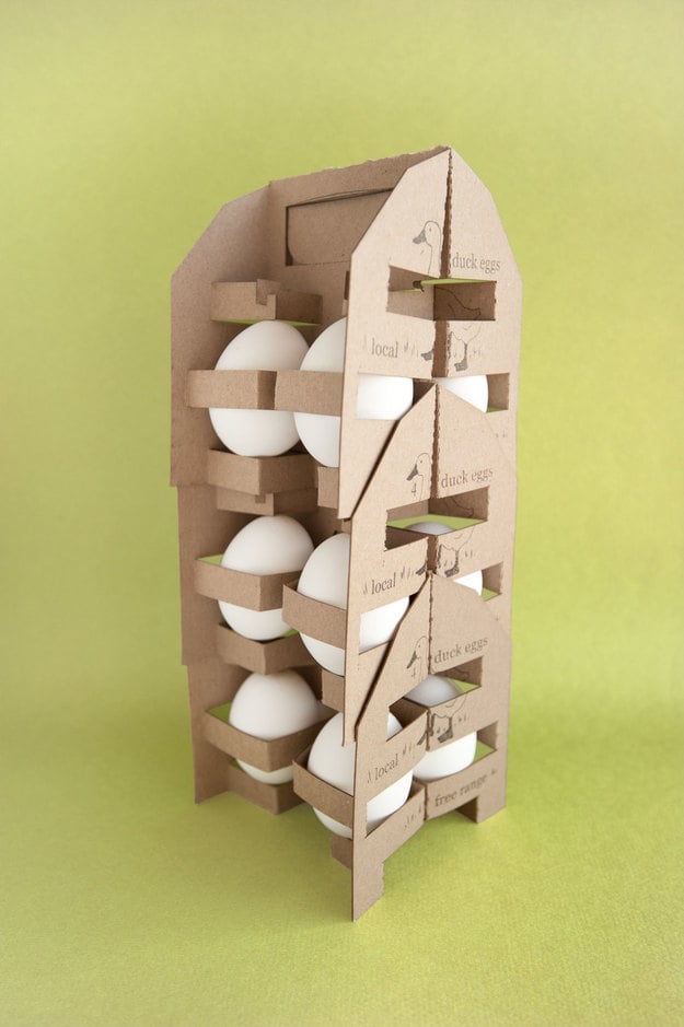
Who would have thought that even the packaging of eggs, often anonymous and all the same, can be rethought in a creative way? The designer Michelle Chin, who thought of a new packaging to differentiate the duck eggs of Cowberry Crossing Farm, a company specializing in the production of organic products at zero kilometer. Her solution, modular and made of recycled cardboard, has a handle inspired by milk transport systems and leaves the product uncovered to highlight its genuineness. A practical proposal and at the same time original and eco-sustainable, which takes its cue from other product sectors to innovate the traditional packaging of eggs: ingenious, isn't it?
Food and fashion, a winning combination
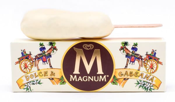
Let's stay in the food sector to explore some examples of packaging inspired by the world of fashion. The first is the Magnum Algida pack signed by Dolce e Gabbana, a tribute to Domenico Dolce's Sicilian origins and the strong link between the fashion house and this region.
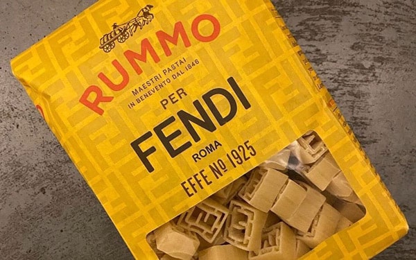
Fendi has also personalized the format and packaging of Rummo pasta to invite the public to the presentation of the SS21 collection during Milan Fashion Week. The Effe N°1925 format of the limited edition pasta imitates the double F logo of the Roman maison, while the packaging shows a family recipe of the stylist.
Music packaging
Music and perfumes have in common the ability to evoke in each of us different memories, emotions and sensations. Many brands have been able to capture this similarity, creating packaging inspired by the world of music.
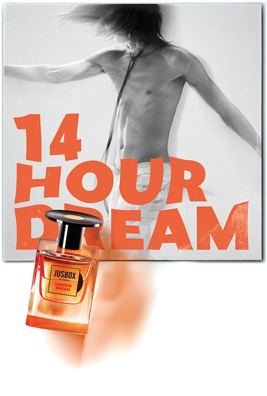
This is the case of the Italian company Jusbox perfumes, which has found the meeting point between these two worlds through "olfactory melodies", fragrances that pay homage to the most important musical icons in history. Each essence is contained in a 78 ml bottle - a reference to the first 78 rpm phonographic record - whose cap recalls the appearance of vinyl. The external box resembles, in its shape and opening system, the packaging of a CD and contains a "lyrics book" that describes the history of the fragrance.
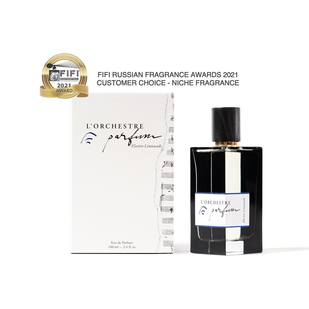
L'Orchestre Parfum, a company founded by musician Pierre Guguen, also pairs its fragrances with a selection of melodies available on the site and has customized the boxes with a musical score.
These are just a few examples of creative packaging that help strengthen the brand image and effectively communicate product and brand features. Thanks to the services offered by Packstyle, all companies - even small ones - can experiment with different solutions by simultaneously printing packages of the same size with different graphics, at no additional cost.

-png.png?width=300&name=Capsule-Caff%C3%A8-Morandini%20(1)-png.png)