
Both flexible and rigid packaging need an effective and original graphic design that arouses the consumer's curiosity and interest and convinces him to buy.
Below you will find a small guide with all the tricks to create an attractive and professional design, including mistakes and risks to avoid.
How to design packaging
To design packaging or its graphics, you must first think about their function. The container is there to protect and preserve the product, while the graphics must attract the buyer's attention, inform him of the product's features and guide his decisions.
You will then choose the type of packaging, flexible or rigid, based on the product's preservation characteristics and the company's values, such as sustainability. Then you will need to set the graphics on an effective, original and persuasive communication.
Most packaging manufacturers take care of the technical design of the packaging and provide their customers with a template to create the print file themselves. Consequently, in this article we will focus on the creation of the graphics to be included in these templates.
How to create graphics for a doypack project
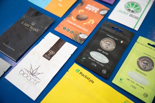
Graphics for flexible packaging offer a few more opportunities than other types of packaging, but they also require some special tricks.
In the case of doypack pouches, in fact, the entire surface is printable, whereas in traditional packaging forms such as cans, tins and bottles, only a part is used for labels and graphics. This is a great advantage, but care and awareness are needed to exploit it.
When creating the graphics for a doypack pouch, we therefore suggest that you
- take advantage of the entire printable surface and leave no uncovered areas
- make sure that the graphics also extend to the bottom of the pouch, but avoid inserting important information in this section
- do not insert text on the zip, if present, as this would limit readability.
Given the large print area, it is particularly important to create a clear and effective graphic design that guides the consumer's eye to the essential information.
Mandatory Information and Other Requirements: Graphics for Food Packaging
Packaging design for the food sector has some additional requirements, mainly related to food safety regulations and the mandatory information it must contain. First of all, the choice of materials used must be compatible with the food contained, so as not to pose a health risk to consumers.
In addition, it will be necessary to include a series of mandatory information in the graphics for the food label, such as:
- the name of the food and its physical state (frozen, powdered, etc.)
- the list of ingredients and, for some of them, their respective quantities
- the nutritional table
- the possible presence of allergens
- the net quantity of the food
- the storage conditions and, in some cases, the conditions of use
- the date of minimum durability or use-by date
- the name and address of the manufacturer
For some specific foodstuffs, other mandatory data are also added, such as origin or alcoholic strength.
Our guide to creating irresistible graphics
Below we have put together a list of seven basic rules for creating safe, compliant and effective packaging. You can use it as a guide when creating your design or as a checklist to make sure you haven't missed any essential steps.
- Design your graphics to be specific to the type of packaging used
As already mentioned in the section on doypack design, each type of packaging has specific characteristics to pay attention to. Before you start working on your project, ask yourself:
- what are the graphic surfaces?
- where do consumers expect to find the information?
- what type of material and surface will you print on?
These are fundamental prerequisites for effective communication.
- Prepare all the elements for clear and effective communication
When you start designing a graphic, it is useful to think about the goals of communication.
- What are the features of your audience?
- How do you want the buyers to perceive the product?
- What are the reasons for buying it?
- What information do you want to bring out?
For example, for an organic product it will be useful to emphasise consumer health care, natural and sustainable production processes, and certification.
This information will help you set up your work correctly and guide you in choosing images, fonts and colours that express exactly what you want.
- Choose a style that matches your brand personality
Branding is important for the recognition of your products and for customer loyalty. Try to choose colours, fonts and graphic elements that reflect your company's personality and match your brand.
Going back to the previous example, if the product you are creating the label for is part of an organic line, but your brand is known for modern and innovative cosmetics in luxurious packaging, a country-style packaging might not be a good idea.
- Follow graphic design principles to emphasise key visual elements
In the second step, we chose the elements to be emphasised. In packaging design, a conscious use of composition, colours, contrasts and fonts is important, not only to create an aesthetically pleasing result.
Make sure that all these elements guide the eye to the essential information and highlight it. Generally these include the brand, the product name and its distinguishing features, but may be different from case to case.
- Let the information breathe
Graphics can be eye-catching and effective even in a simple style. But even in the case of complex and unusual designs, it is important not to overcrowd spaces and create confusion by including too many visual elements.
In addition, by leaving sufficient spaces free in strategic points of the graphic, it is possible to use them for later modifications and additions, such as in the case of a new product line, a limited-edition or the sticker of a promotion.
- Include all mandatory information and make it easy to find
Depending on the type of product that will be contained in your packaging, there are specific standards and mandatory information that must be included in the graphics.
- For food, we have already seen an exhaustive list, including ingredients, allergens, storage methods and nutrition tables.
- For cosmetics, in addition to the name and address of the manufacturer, there is the minimum durability, ingredients and precautions for use.
- Even for detergents, the instructions for use, the content and quantity of certain chemicals, including potential allergens, and the dosage to be used must be shown on the packaging.
Make sure this information is always clearly visible and easy to find.
- Respect text and information positioning conventions
An original and eye-catching design catches the eye, but packaging also plays an important communicative function and must help the consumer make purchasing decisions. Readability and clarity are therefore essential.
If there are conventions in the type of packaging you are working on regarding the positioning of information elements, such as nutritional values or expiry date, do not break them. Make sure that the buyer finds them where he expects to see them, quickly and without difficulty.
Some mistakes to avoid
We have already seen all the tricks to create an original and effective packaging design, but it is only fair to also talk about the most common mistakes in this process. Below you will find a short list of things not to do.
- Do not print important information close to the folds and cut lines or on the bottom of the pouch. Texts lose legibility and graphics are less effective when they overlap the folds. In addition, the bottom of the pouch is often ignored by buyers.
- Do not ignore abundance lines. In the template provided by the packaging company you will find three sets of lines, which correspond to three types of margins: fold, cut and abundance. Remember to fill the entire template with graphics, including the spaces between the cut and bleed lines. Small deviations may occur during printing and the abundance lines are there to adjust for this margin of error.
- Do not use low resolution images. All images used in a file for printing should have a minimum resolution of 250 dpi, if possible 300 dpi. Lower resolutions may compromise the quality of the final output.
- Do not forget the orientation of the finished package. When inserting graphics into the template remember that the orientation of some elements will change from what you see on the screen. As a result, some graphics, such as the one for the back of a doypack pouch, will have to be inserted into the template upside down.
Follow all these steps to create a graphic ready to conquer the shelves!